Over the past 20 years, LST has experienced remarkable growth while maintaining the same quality of work and culture. Our rebrand pays homage to where we came from while embracing the future.
Our in-house designer Micheal Girma designed the new logo, and it ties together components of the previous iteration with a more modern look and feel. The element above the letters represents forward movement and is a nod to contrails, the cloud-like vapor that airplanes leave in their trail. We also connected the letters in the logo to define a new business phase for us, having graduated from a small business under government contracting standards. The LS in our name came from the initials of our founders, who have now passed on; however, we still maintain the excellence and humanity that they established at the very beginning.
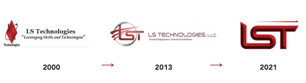
As you can see, over time, the logo becomes more streamlined and straightforward, as companies often do as they become more established. We took this approach with our website as well. The website is much simpler, and we introduced more color and imagery to tell our story. Stay tuned for future updates.